
Best Of
The best colors for north facing rooms in the Midwest
Reviewed by David Cook · Last updated July 15, 2026 · 6 min read
In a north facing room in the Midwest we steer clients toward warm whites and warm greiges instead of cool grays, because north light already leans blue and gray, and a cool paint color stacks on top of that and can read flat or even a little cold on a gray Illinois afternoon.
The short version
- North light is cool and consistent, no direct sun to warm it up.
- Cool grays often go blue or muddy in that light here.
- Warm whites and warm greiges balance the room out.
- LRV matters as much as the color name.
- Always sample on the actual wall, morning and evening both.
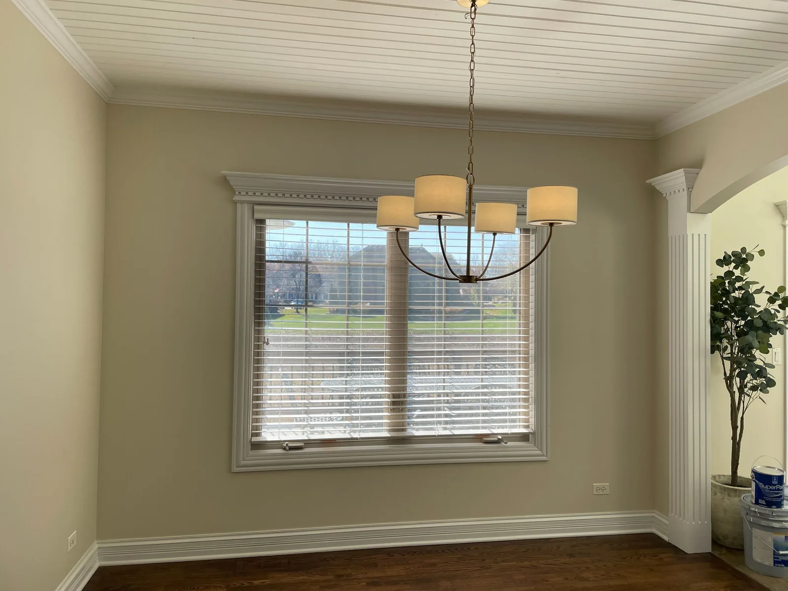
Why north facing rooms behave differently
A north facing window never gets direct sun. What it gets is soft, even, indirect light that comes from the sky rather than the sun itself, and that light naturally carries more blue in it than light from an east, west, or south window. That is true everywhere, but it is more noticeable through an Illinois winter when the sky itself is gray for weeks at a time.
The practical effect is that any color with a cool undertone gets amplified in a north room. A gray that looks neutral in a paint store under bright lighting can read distinctly blue or even a little purple once it is on your north wall.
Why gray goes blue in this light
Most "greige" and gray paints have a small amount of blue, green, or purple mixed in even when the name suggests neutral. In a south or west room with warm sun hitting the wall, that undertone gets canceled out. In a north room with cool light and no direct sun, that same undertone shows up clearly.
This is the single most common callback we get on color choice: someone picks a gray from a fan deck or a bright showroom, and once it is on their north facing living room wall it looks colder and bluer than they expected.
What works better in north rooms
Warm whites with a hint of yellow or cream undertone tend to hold up better in north light than stark or cool whites. Warm greiges, the ones with a beige or taupe lean rather than a blue lean, also read more balanced.
You do not have to go all the way to a beige-heavy palette. The goal is just to counteract the room's natural cool bias, not overcorrect into a yellow room.
Why LRV matters here too
LRV, light reflectance value, tells you how much light a color bounces back into the room. North rooms already get less light overall than a south or west room, so a color with a very low LRV can make the room feel darker than you expect, on top of the color shift itself.
For a north room we usually push a little higher on LRV than we would for a sunny south room, just to keep the space from feeling flat and dim on a cloudy day.
Why you have to sample on the actual wall
A color chip under store lighting tells you almost nothing about how it will look on your north wall. We tell every client to buy a sample, paint a real patch directly on the wall, not on poster board, and look at it at two different times of day, once in the morning and once in the evening.
North light does not swing as much through the day as south or west light does, but it still shifts, and the paint will look slightly different under a gray morning sky than it does under evening lamp light. Seeing both before you commit is the only way to avoid a repaint.
Paint at least a two foot square, not a tiny swatch, and put it on more than one wall in the room if the room has an odd shape or multiple windows. A small patch next to a corner or a doorway can trick your eye into thinking a color reads warmer or cooler than it will once it covers the whole wall.
Where does a north facing room fail even with the right color
Even a well chosen warm color can still look flat in a north room if the room has no other light sources working with it. If the only fixture is a single overhead light or a dim lamp, the wall color will read duller than it does in the store, no matter how warm the undertone is. We tell clients this is a lighting problem, not a paint problem, and no color choice fully fixes a room that just does not get enough light.
We also see homeowners overcorrect by going too warm, landing on a color that looks orange or dated once it is up on all four walls. The goal is a gentle warm balance, not a dramatic shift, and that is exactly why the sample step matters more here than in a sunnier room where mistakes are more forgiving.
What do we recommend when someone is stuck between two colors
When a client is torn between a slightly warmer and a slightly cooler option for a north room, we usually recommend the warmer one, since a north room already leans cool and a warm color has more room for error before it looks wrong. A cool color in a north room has almost no margin, it either works or it reads cold.
If the client already owns furniture, rugs or trim with strong cool undertones, that is the one case where a cooler wall color can still work in a north room, since it matches rather than fights what is already in the space. Bring a photo of the room and its furnishings to your estimate and we will factor that in before recommending a color.
Your next step
Price your project yourself in about a minute. No form, no sales visit needed to see a number.
Read next
Reviews
Sherwin Williams vs Benjamin Moore for Illinois interiors
A field comparison of Sherwin Williams and Benjamin Moore paint lines for Illinois homes, from a crew that uses both every week.
6 min read
Reviews
Is Sherwin Williams Emerald worth the extra money?
Where Sherwin Williams Emerald paint earns its price and where a mid tier line does the same job for less.
5 min read
Cost & Pricing
What interior painting actually costs in Huntley and the Fox Valley
Interior painting starts at $1.10 per square foot of wall. A 10 by 10 room in two coats runs about $589. Ceilings, base trim, closets, windows, doors and door frames add to the cost of the project. Here is what can move the final rate toward $5.00 per square foot.
6 min read
Ask us anything
Still have a question?
Send it over and we will answer it. We answer questions publicly on this site, because if you are wondering it, someone else is wondering the same thing and nobody has told them straight.